Choosing the right grout color isn't just a finishing touch—it's one of the most critical design decisions you'll make for your tile project. The fundamental choice boils down to one question: do you want the grout to blend in for a seamless, monolithic look, or do you want it to contrast and make the tile pattern pop? That single decision will completely change the vibe of the entire room.
The Underrated Design Element in Every Room
Grout is truly the unsung hero of tile design. People spend weeks picking the perfect tile but often treat grout as an afterthought. In reality, it has the power to unify a room, create a bold graphic statement, or subtly enhance the natural beauty of the tile itself. I'd argue it's just as important as your countertop or cabinet selection.
A simple shift in grout color can make a room feel bigger, more modern, or incredibly serene. For anyone aiming for that high-end, custom-designed look, getting this detail right is a chance to add a personal touch that elevates the whole project.
Grout as a Strategic Design Tool
Stop thinking of grout as just the stuff that fills the gaps. It's a powerful design tool. Those grout lines create a grid that can either melt into the background or jump out as a defining visual element, and that directly sets the mood for your space.
Here’s how to think about it:
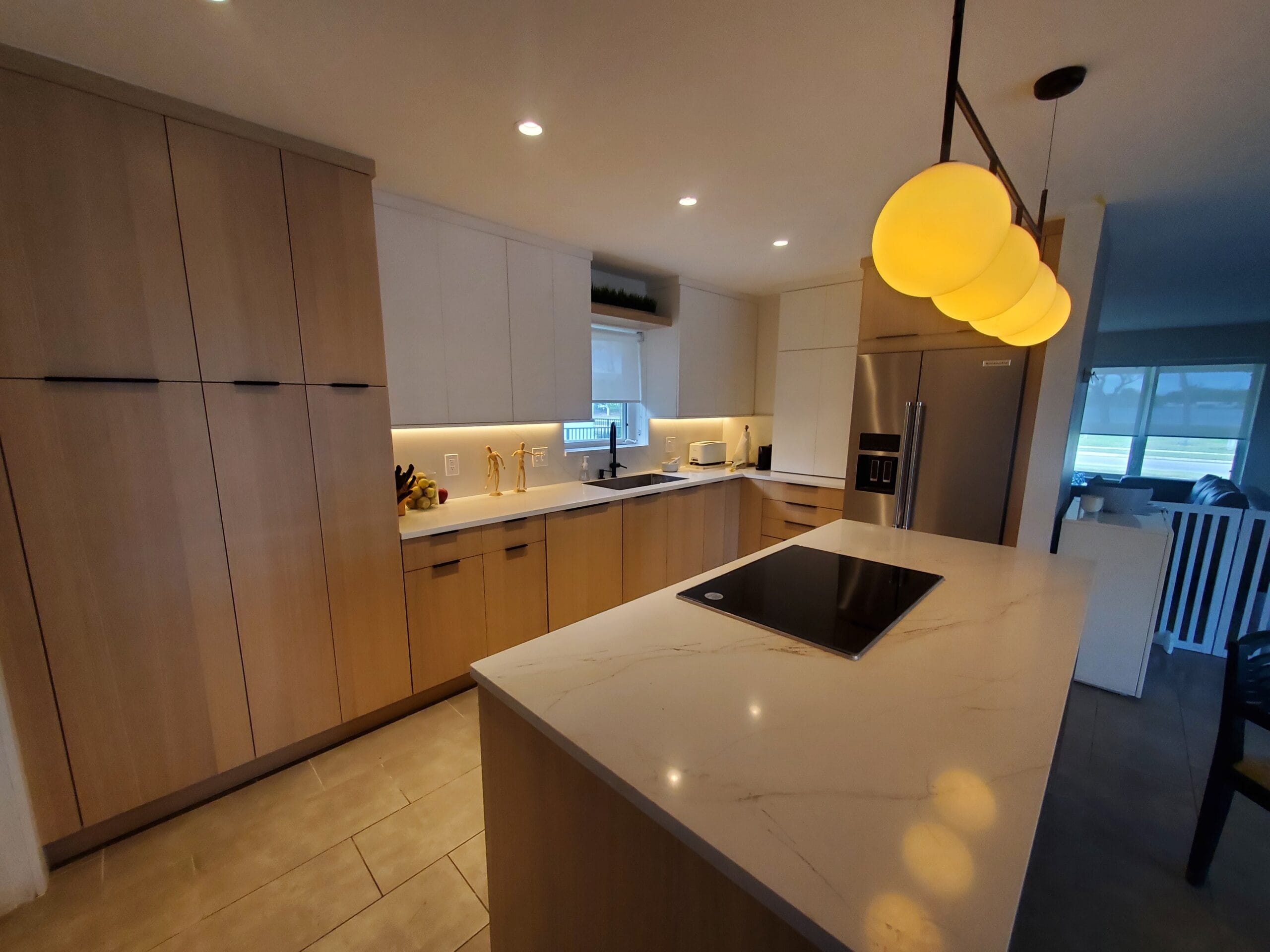
- Creating Unity: When you match the grout to the tile color, you get a uniform, seamless surface. This trick is perfect for making smaller spaces, like a powder room or galley kitchen, feel larger and more open. It lets the texture of the tile—especially with beautiful natural stone—be the star of the show.
- Adding Drama: A high-contrast choice, like the classic dark charcoal grout with white subway tile, puts the spotlight on the shape and layout of each tile. This approach instantly turns a wall or floor into a graphic feature, which works incredibly well for modern farmhouse or industrial aesthetics.
- Enhancing Patterns: If you've invested in a complex pattern like herringbone or hexagon, a contrasting grout is almost essential. It accentuates the intricate design and makes the pattern pop. Without that contrast, all that beautiful work can get lost in a sea of sameness.
Beyond Aesthetics: Personal Style and Home Value
Ultimately, your grout choice is a reflection of your personal style. A bold, unexpected color can inject a ton of personality into an otherwise neutral bathroom. On the other hand, a soft, coordinating tone can help create a spa-like sense of calm. The details of your tile work, grout included, scream quality craftsmanship (or a lack thereof). If you're still working through the basics, our guide on how to choose shower tile can help lay the groundwork.
A well-chosen grout color doesn't just look good—it signals a thoughtful and well-executed design. This attention to detail contributes to a polished, professional finish that can significantly boost your home's perceived value.
Think of grout as the final brushstroke on your masterpiece. It’s a small detail with a massive impact, so making a deliberate choice is something you'll appreciate for years to come.
First Things First: Look at Your Tile and the Room
Before you even think about picking up a grout color chart, take a step back and really look at your tile and the space it’s going in. This is the single most important step. It's not just about finding a color that "matches"—it's about understanding how your tile, grout, and the room's light will all work together.
Start with the tile itself. Is it a simple, solid color, or is it a beautiful, busy tile with lots of veining and color variation? A dynamic slate or marble tile, for example, often shines best with a quiet, neutral grout that lets the stone be the star. On the other hand, a classic subway tile is like a blank canvas; the grout color you choose will completely define its final look.
Get to Know Your Tile’s Personality
Beyond just the color and pattern, the physical nature of your tile heavily influences your grout choice. The edge, the finish, and the material itself all have a say in the final outcome.
Think about these specific characteristics:
- The Edge: Does your tile have super-sharp, rectified edges that allow for razor-thin grout lines? Or are the edges more traditional, with a bit of a curve? Rectified tiles can have grout lines as small as 1/16", making the grout almost disappear. Tiles with softer edges need wider grout lines, which automatically makes the grout a more noticeable part of the design.
- The Finish: A tile's finish—whether it's matte, polished, or textured—changes everything. Polished tiles are like mirrors; they reflect a ton of light, which can make the grout lines look darker than they really are. A matte tile, however, tends to absorb light, giving the grout color a softer, more true-to-the-sample appearance.
- The Material: Every tile material behaves differently. If you're still exploring your options, our guide on the different types of bathroom tiles is a great resource. This is critical because a porous natural stone like travertine has very different sealing needs compared to a workhorse porcelain tile.
My Two Cents: I always tell clients to think of tile and grout as a partnership. One should elevate the other. If you’ve spent a fortune on stunning, handmade Zellige tile, let the grout take a backseat. If you’re working with a simple, affordable ceramic, a bold grout can be the element that makes it pop.
Consider the Room as a Whole
Now, zoom out and look at the entire room. The function and feel of the space are just as important as the tile itself. When you're making these kinds of decisions, it's helpful to consider all the key aspects of bathroom design to ensure a cohesive result.
Lighting is everything. I can't stress this enough. Watch how the light—both natural and artificial—hits your tile at different times of the day. A grout color that looks like the perfect warm gray in the morning sun might look muddy and drab under your vanity lights at night.
This is a good time to create a simple framework to guide your decision. A quick checklist can help you organize your thoughts and ensure you don't miss anything important.
Grout Choice Framework: Tile and Room Analysis
| Consideration | What to Look For | Impact on Grout Choice |
|---|---|---|
| Tile Pattern & Color | Is it a solid color or does it have complex veining/patterns? | Busy tiles often need neutral grout; simple tiles can handle bold or contrasting grout. |
| Tile Edge | Rectified (sharp, 90-degree) vs. Pressed (rounded) | Rectified edges allow for thin, subtle grout lines. Pressed edges require wider, more visible lines. |
| Room Lighting | How does natural and artificial light change the tile's look? | Test samples in the room. A color can look completely different under warm vs. cool light. |
| Room Size | Is the space small and compact or large and open? | Lighter, blending grout can make a small room feel larger. Dark, contrasting grout can feel cozier. |
| Existing Finishes | Countertops, cabinet colors, hardware (faucets, knobs) | The grout should complement the existing "fixed" elements to create a cohesive design palette. |
Using a checklist like this turns a potentially overwhelming decision into a logical process, ensuring your final choice feels intentional and perfectly suited to your space.
Thinking like a designer from day one means your grout won't be an afterthought. Instead, it will be the finishing touch that pulls the entire room together.
The Great Debate: To Blend or To Contrast?
This is it. The single biggest decision you'll make when it comes to grout. Do you want it to blend in seamlessly, or stand out and make a statement? There's no wrong answer, but your choice will completely change the final look of your tile. It’s all about deciding if you want your grout to be a quiet supporting actor or a co-star.
Let's dig into what each approach really means for your space.
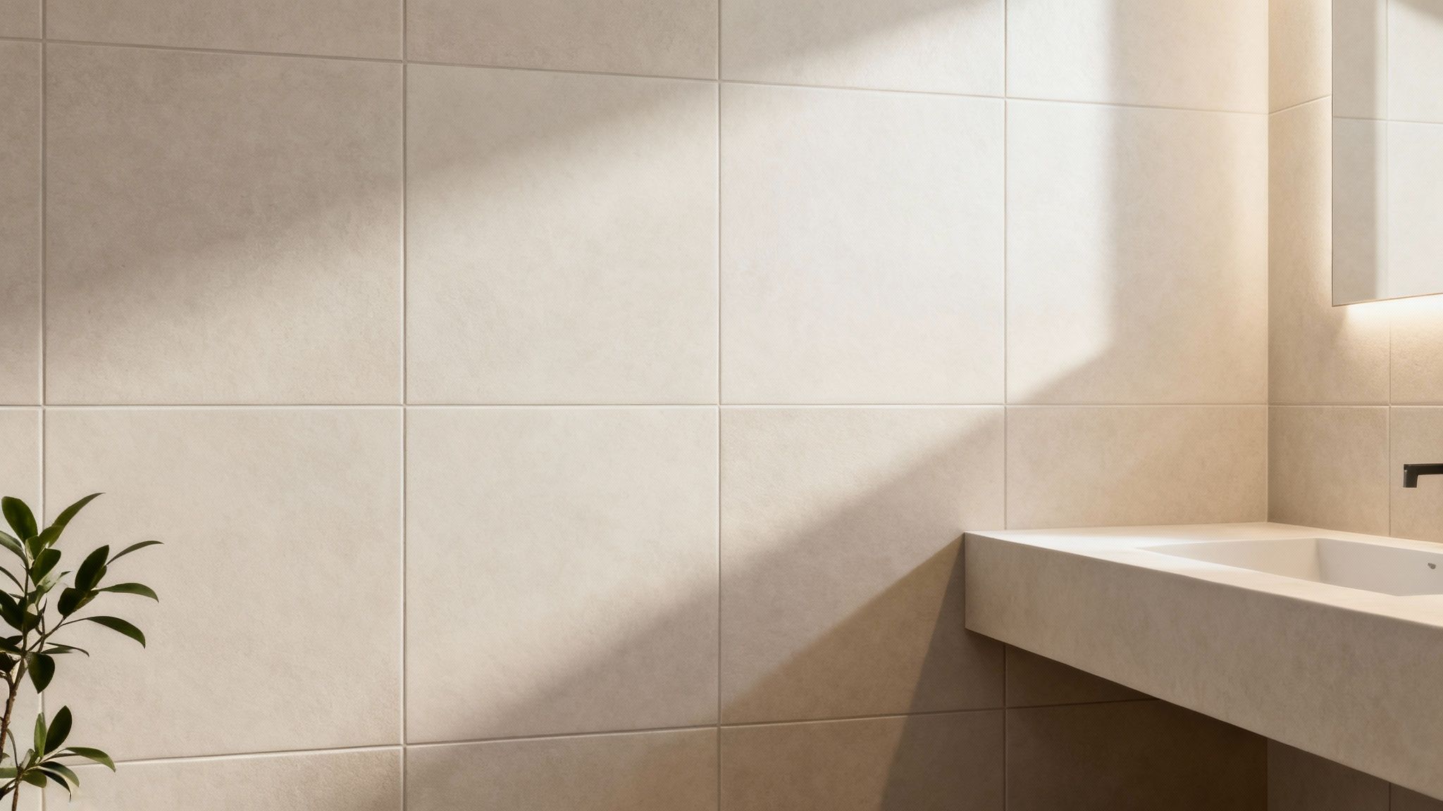
The Art of Blending Grout
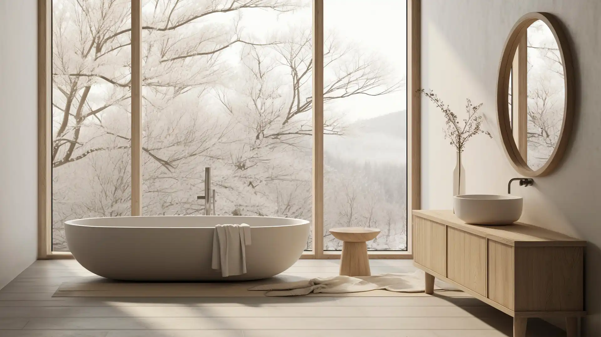
Choosing a grout that matches your tile is an intentional move toward subtlety. The goal is to make the grout lines virtually disappear, creating a clean, monolithic surface. This trick is a designer's favorite for making smaller rooms, like a powder room or a tight galley kitchen, feel much more spacious. By downplaying the grid pattern, the eye reads the floor or wall as one continuous, expansive plane.
This strategy is also perfect when you want the tile itself to be the hero. If you've fallen in love with a beautifully veined marble, rustic handmade Zellige tiles, or a porcelain with a complex pattern, a matching grout lets that tile do all the talking. It creates a calm, sophisticated backdrop where the tile’s unique character can shine without any distractions.
So, when does blending work best?
- Creating a Calming Effect: A uniform surface feels less busy and more serene. It's the perfect choice for crafting a spa-like bathroom retreat or a minimalist, uncluttered kitchen.
- Showcasing Tile Texture: For tiles with interesting surfaces—like natural slate, tumbled stone, or handcrafted ceramics—blending the grout ensures that tactile quality is the main event, not the grid.
- Hiding Minor Imperfections: Let's be real, not all tiles are perfectly uniform, especially handmade ones. A matching grout is incredibly forgiving and helps mask slight variations in size or spacing for a flawless finish.
A well-chosen blending grout creates an incredibly high-end, sophisticated look through sheer understatement. It shows a design confidence that doesn't need to shout to be noticed.
Making a Statement with Contrast
On the flip side, picking a contrasting grout is a bold, deliberate choice. You’re not just filling gaps; you're using the grout lines to frame each tile, turning the entire installation into a graphic design feature. It’s a classic for a reason.
Just think about the timeless appeal of a white subway tile with dark gray or black grout. That single choice instantly defines a style, whether it's modern farmhouse, industrial chic, or vintage-inspired. The contrast celebrates the iconic running bond pattern. The same goes for more intricate layouts—herringbone, basketweave, or hexagon tiles truly come alive when their geometric shapes are outlined by a contrasting grout.
You don't have to go for a black-and-white look, either. Even a subtle contrast is powerful. A light grout against a dark tile can feel incredibly fresh and modern, while a dark grout with a light tile can add a sense of depth and history.
This is more than just a niche trend; it’s a major shift in design. In North America, 65% of premium kitchen remodels now use colored or contrasting grout, a massive jump from just 35% in 2015. Homeowners are realizing grout is a powerful design tool, not just a construction necessity.
This decision tree can help you map out which path makes the most sense for your project.
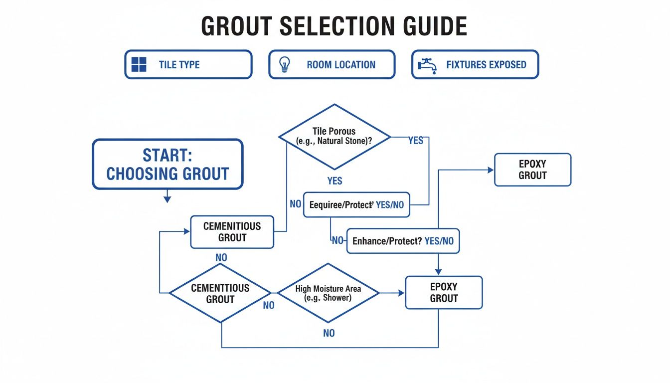
It’s a simple way to connect your tile, your room, and your overall style to a smart grout strategy.
Finding the Sweet Spot: Neutral Contrast
What if a perfect match feels too plain but a stark contrast feels too loud? Welcome to the middle ground. A 'neutral contrast' is about choosing a grout that's just a few shades lighter or darker than your tile.
This technique adds just enough definition to highlight the tile pattern without creating a busy, high-drama look. It’s a fantastic way to add a layer of dimension to your space.
Imagine you have a medium-gray floor tile. A solid gray floor can sometimes look flat and uninspired. But by picking a slightly lighter gray grout, you softly outline each tile, adding subtle depth and visual interest. It’s a pro move that keeps things sophisticated. If you're looking for more real-world examples, our guide to stunning kitchen backsplash tile ideas is packed with inspiration.
Ultimately, your tile, the mood of the room, and your own personal style will guide you to the perfect grout. Take your time, test your options, and you’ll find the perfect balance that makes your project sing.
Choosing Between Cement and Epoxy Grout
Deciding on the perfect grout color is a huge step, but the job isn't done yet. Now you have to pick the grout material itself. This choice is about more than just what fits the budget; it dictates how your grout will hold up over the years, how vibrant its color will stay, and how much time you'll spend cleaning it.
The two main contenders on the market are the classic cement-based grout and the more modern epoxy grout. Think of it as choosing tires for your car—one is a reliable all-season option, while the other is a high-performance model built for tough conditions.
The Workhorse: Cement-Based Grout
For decades, cement-based grout has been the industry standard, and for good reason. It’s inexpensive, you can find it anywhere, and it comes in a massive spectrum of colors. This makes it incredibly easy to find a shade that either perfectly matches your tile or provides that pop of contrast you're looking for.
The catch? Its biggest weakness is that it's porous. At its core, cement grout is just a mix of cement, sand, and water, which means it acts like a tiny sponge, soaking up moisture and liquids. This is what leads to stains, mildew, and general dinginess over time, especially in places like a shower or behind a kitchen sink.
To keep it looking fresh, cement grout has to be sealed right after it’s installed. You’ll also need to re-seal it every year or two to maintain that protective barrier. If you skip this step, that beautiful white grout line can quickly turn grimy from everyday spills and splatters.
The Game-Changer: Epoxy Grout
Epoxy grout is a whole different ballgame. It's a blend of epoxy resins and a filler powder that cures into a hard, non-porous material that feels a lot like plastic. It definitely comes with a higher price tag—often three to five times more than its cement-based cousin—but for many projects, the long-term benefits are well worth the initial cost.
Because epoxy isn't porous, it's naturally resistant to just about anything you can throw at it: stains, harsh chemicals, and water. Red wine spill on the backsplash? It’ll wipe right off. Soap scum building up in the shower? No problem. This makes it an absolute hero for:
- Kitchen Backsplashes: Perfect for fending off grease, food stains, and constant scrubbing.
- Bathroom Floors & Showers: A must-have in wet zones where mold and mildew love to grow.
- High-Traffic Entryways: Stands up to the dirt and grime that gets tracked in from outside.
If you’re dreaming of pristine white or very light-colored grout lines, epoxy is your best bet. It locks the color in permanently, so it looks just as crisp and clean years down the road as it did on day one. Best of all, it never needs to be sealed.
Epoxy grout is an investment in low maintenance and long-term color integrity. It’s the ultimate solution for anyone who wants a "set it and forget it" grout that stays true to its original color.
To help you decide what's right for your home, it helps to see a side-by-side comparison of the two main types of grout. Each has its place, and your choice will come down to balancing your budget, the location of the tile, and your tolerance for future maintenance.
Cement Grout vs. Epoxy Grout: A Homeowner's Guide
| Feature | Cement-Based Grout | Epoxy Grout |
|---|---|---|
| Durability | Good, but can crack over time. | Excellent, highly resistant to cracking and shrinking. |
| Stain Resistance | Low (requires sealing to protect against stains). | Extremely high (non-porous and naturally stain-proof). |
| Water Resistance | Low (absorbs water, can lead to mildew). | Excellent (waterproof, ideal for wet areas). |
| Cost | Low (very budget-friendly). | High (significant upfront investment). |
| Color Consistency | Good, but can lighten as it dries and discolor over time. | Excellent, color is locked in and remains consistent. |
| Installation | Easier for DIYers, more forgiving. | More challenging to work with, sets quickly. |
Ultimately, even the best grout is only as good as its installation. If you want a flawless, long-lasting finish without the headache, exploring professional tile grout services can make all the difference. Your final choice really boils down to your budget, where the tile is going, and how much weekend time you want to spend on upkeep.
Never Skip the At-Home Grout Test
If there's one mistake I see homeowners make time and time again, it's trusting the tiny plastic color chip from the hardware store. The fluorescent lighting in a big-box store has nothing in common with the warm, natural light in your kitchen. That little sample stick simply can’t tell you how a color will read once it’s covering an entire floor.
The only way to be certain is to test your top choices in the room where they'll actually live. It’s a non-negotiable step that elevates a project from just "good enough" to something you'll love for years. This one small effort turns a shot in the dark into a confident, informed decision.
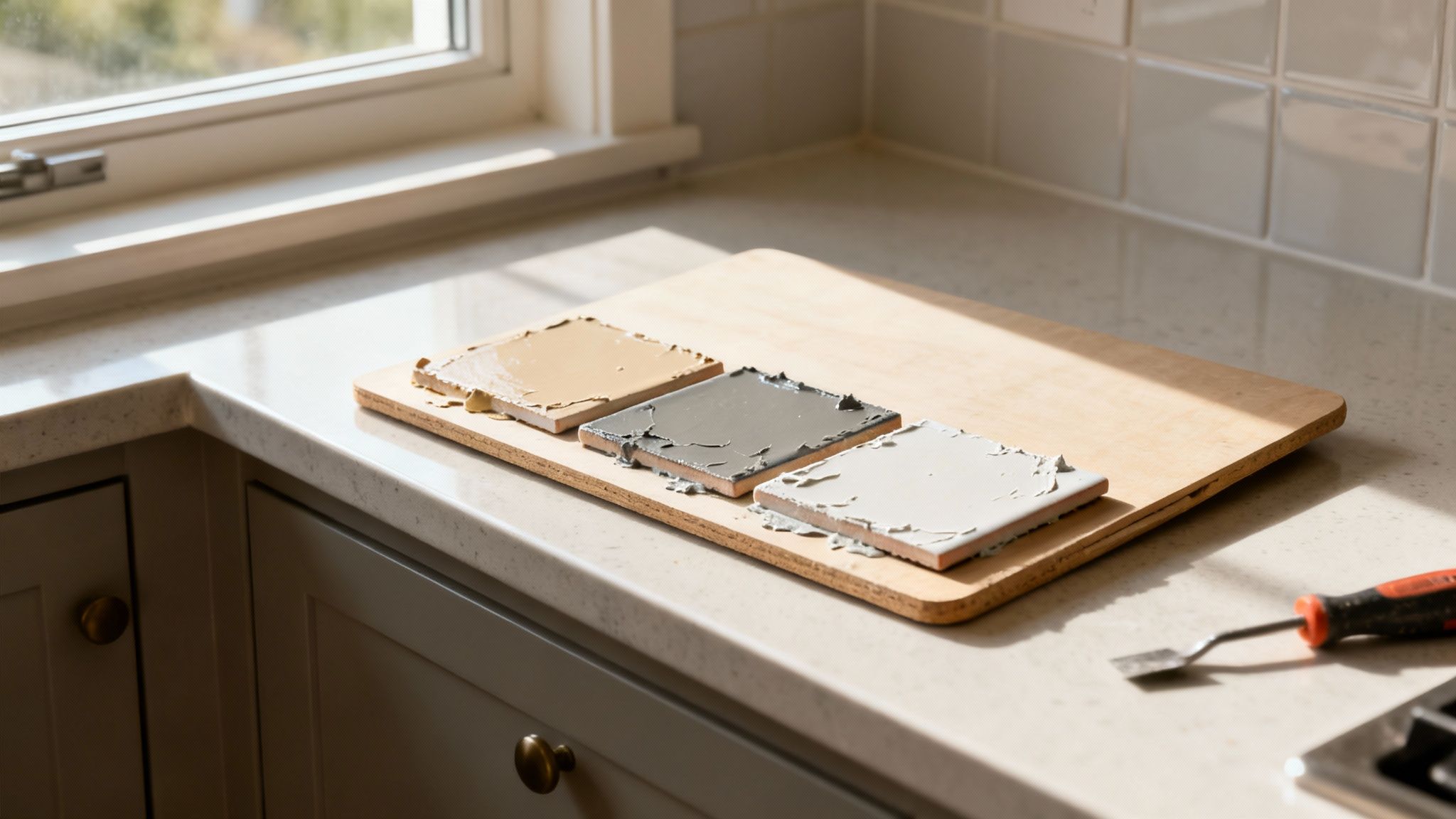
How to Make a Grout Sample Board
Creating a test board is surprisingly simple. You’ll just need a few leftover tiles from your project—three or four is perfect. If you don't have any extras, it's worth every penny to buy a few loose ones. Think of it as cheap insurance against a costly mistake.
Here’s my go-to method for a quick and effective test board:
- Mount Your Tiles: Find a piece of scrap plywood or even some heavy cardboard. Use a little hot glue or construction adhesive to stick the tiles down, making sure to leave the same joint width you've planned for your final installation.
- Mix and Apply: Whip up a small batch of each grout color you're considering. Apply one color to each joint on your board, then clean off the excess just like you would during the real deal.
- Let It Fully Cure: This is the most important part. Grout always dries much, much lighter than it looks when it's wet. You absolutely must give it at least 24 hours to cure and reveal its true, final hue.
Seriously, don't rush this. The color you see an hour after mixing is not the color you’ll be living with for the next decade. Patience here pays off big time.
Put Your Samples to the Test in Real Light
Once your board is completely dry, the real evaluation begins. Move the sample board into the room you're tiling and just live with it for a day or two. The whole point is to see how the different grout colors react to the unique lighting conditions of your space as they change throughout the day.
This simple step is the difference between hoping for the best and knowing you’ve made the right choice. It moves your decision from a theoretical guess to a real-world certainty.
Make sure to look at the board in all scenarios:
- Morning Sunlight: How does the bright, direct light hit it?
- Artificial Light: Flip on your vanity lights or under-cabinet lighting at night. Does the color wash out or change tone?
- In the Shadows: Stick it in a darker corner of the room. Does the color turn muddy or disappear?
This practical approach also forces you to think about maintenance. Recent market data from Europe and North America shows that a surprising 62% of homeowners end up regretting a neutral grout choice because it shows every speck of dirt. This has sparked a major shift toward darker shades like slate and espresso, which can cut down on visible grime and reduce cleaning frequency by up to 50%. You can dig deeper into these grout colorant market trends to see how other homeowners are thinking. Testing a sample at home will quickly tell you whether that beautiful, light beige grout is truly a fit for your lifestyle.
Answering Your Top Grout Color Questions
Even after you've thought through the big picture of blending, contrasting, and grout types, a few specific questions always seem to pop up. It's these final details that really make the difference between a tile job that's just okay and one that looks truly professional.
Let’s tackle some of the most common questions I hear from homeowners. Think of this as your quick-reference guide to solve those last-minute dilemmas and lock in your choice with total confidence.
Should Grout Be Lighter or Darker Than The Tile?
This is the classic crossroads every homeowner faces, and there’s no single right answer—it all comes down to the look you're trying to achieve.
Choosing a grout lighter than your tile is the go-to move for creating a soft, seamless look. It helps the room feel a bit more spacious and puts all the focus on the tile itself. If you’ve invested in a beautiful natural stone or a tile with a lot of texture and variation, lighter grout lets it be the star of the show by downplaying the grid pattern.
On the other hand, a grout darker than your tile creates instant drama and contrast. This is how you make the pattern of the tile pop. It’s a fantastic choice for highlighting the shape of classic subway tiles, hexagons, or penny rounds, turning your floor or backsplash into a graphic design element.
A Pro Tip From The Field: Darker grout is a lifesaver when it comes to hiding dirt, making it a super practical choice for busy floors. If you're stuck in the middle, try picking a color just a few shades different from your tile. It gives you some soft definition without looking too busy or stark.
How Does Grout Width Affect My Color Choice?
This is a huge one that people often forget about. The width of your grout lines completely changes how much of an impact the color makes.
With wider grout lines (think 1/8" or more), the grout becomes a major part of the overall design. A contrasting color in a wide joint will look incredibly bold and graphic. A matching color in that same wide joint will still be very noticeable, often lending a more rustic or traditional feel, especially with handmade-style tiles.
When you have super-thin grout lines (1/16" or less), the grout plays a much quieter role. A matching grout color here can almost disappear, creating a nearly seamless, solid surface. Even if you choose a contrasting color, it will read more like a crisp, delicate pinstripe rather than a heavy grid. Keep in mind, your desired grout width can also dictate the type of grout you need, as very thin lines often require a specific unsanded or high-performance product.
What Is The Easiest Grout Color To Keep Clean?
Without a doubt, the low-maintenance champions are the medium-toned neutrals. We're talking about those workhorse shades like warm gray, greige, beige, and taupe. These colors are brilliant at camouflaging the realities of daily life.
They’re dark enough to hide dirt and minor spills but not so dark that they show every little bit of soap scum or light-colored lint, which can be a problem with black or charcoal grouts. They really are the sweet spot for practicality.
While pristine white grout looks amazing on day one, it's notoriously difficult to keep clean, especially in kitchens, bathrooms, and on floors. It highlights every speck of dirt and is very susceptible to staining.
If your heart is set on a light-colored grout, your best bet is to upgrade to a high-performance epoxy grout. Its surface isn't porous like traditional cement grout, so it resists stains from things like coffee, red wine, and mud. It’s a game-changer for keeping things looking fresh.
Can I Change My Grout Color Later On?
Yes, you can! You don't have to rip out all your tile just to change the grout color. You've got two main routes to go, depending on the condition of your current grout and how much work you want to put in.
The easiest method is using a grout colorant or stain. Think of it as a durable, colored sealant that paints right over your existing cement-based grout. The process is pretty straightforward:
- Deep Clean: You have to get the grout lines spotlessly clean. Any dirt, grease, or old sealer will prevent the colorant from sticking.
- Apply Carefully: You use a small brush to "paint" the colorant onto the grout lines, wiping any excess off the face of the tiles as you go.
- New Seal: The colorant itself creates a new, tough seal, protecting the grout from future stains.
This is a fantastic DIY project for updating a dated look or fixing a color choice you regret.
However, if your grout is cracking and failing, or you want a more permanent fix, the only real option is to remove the old grout and replace it. This requires a special tool to grind out the old material before installing new grout from scratch. It's a much more labor-intensive (and dusty) job that is often best left to a professional.
Feeling confident about your grout choice is the final step in creating a space you’ll love. If you’re in the Boca Raton area and want expert guidance from start to finish, the team at Kitchen Renovations Perfected can help you pull every detail together for a flawless result. Explore our services and book a complimentary consultation at https://www.kitchenrenovationsperfected.com.